Friday, February 27, 2009

Weekend Video


The art of the raconteur is not much in evidence these days, but every once in a while you stumble across a great story teller. I was watching David Letterman last month when his guest was Zach Braff and I thought he was so charming and funny and self-deprecatory that without knowing much about him or having seen his movie or t.v. show, I became a fan based solely on this.

Wednesday, February 25, 2009

Postcard from L.A.


A quick trip to Los Angeles began by meeting up with my friend Tom Adler. Our plan was to meet for lunch at The Getty - I was coming from Long Beach airport, he was driving down from Santa Barbara - and amazingly we both pulled up to the Getty front gate at exactly the same time! So the premonition was for a good day and the Getty did not disappoint with a delicious lunch in the cafeteria (I highly recommend their fresh taco plate) and two excellent photography shows.

The first - a small show titled "In Focus: The Portrait" - covers a wide range of photographic portraits from the 19th Century to the end of the 20th including formal portraits, "intimate" pictures, and documentary photographs. It was an excellent and provocative selection, but annoyingly The Getty does not allow you to take pictures (and have very few on their website) so most of the pictures you see here were snapped surreptitiously before different guards asked me to stop. Nevertheless it added a touch of excitement to the experience!

The Getty (like the Met) also has wonderfully lucid wall texts and one in particular seemed worth sharing - a quote from Richard Avedon which accompanied his diptych portrait of Francis Bacon: "A photographic portrait is a picture of someone who knows he's being photographed and what he does with this knowledge is as much a part of the photograph as what he's wearing or how he looks. He's implicated in what's happening and he has a certain real power over the result." Very Avedonian!

I've purposefully left the top picture without a caption because it may surprise some of you. You'll find the answer at the bottom of this post.*


A Young Girl in Ennis, Ireland, Dorothea Lange, 1954


Marlene Dietrich. Cecil Beaton. 1930s.


The second and larger show at The Getty was "Dialogue among Giants: Carleton Watkins and the Rise of Photography in California". Weston Naef's final show as the museum's director of photography, it's a thorough and exhilarating survey that includes Watkins' mammoth plate camera (about the size of a car) and many if not all of my favorite Watkins photographs. Unfortunately it's only up through March 1.


Yosemite Valley from the "Best General View, 1866" No. 2


Cypress Tree at Point Lobos, Monterey County, 1883 - 1885


An atypical, but one of my favorite Watkins pictures - "Late George Cling Peaches, Kern County, 1889".


*And the answer to the top picture: Georgia O'Keeffe by Alfred Stieglitz!


Tuesday, February 24, 2009

Get Back!


Sometimes themes just present themselves. A bevy of backs began with an e-mail from the photographer David Schoerner informing me he had recently started working on a series of photographs inspired by the 1988 painting "Betty" by Gerhard Richter. (That's Schoerner above and Richter below.) Then the next thing you know back views are popping up everywhere!


This from Stuart O'Sullivan:


A trio of fashionable backs from The Sartorialist:


A pair of images showing what it takes to work at French Vogue from Tommy Ton of Jak and Jil:


These from Casia Bromberg, an interesting photographer from Sweden:


And lastly, if just the back of a head can count, this old favorite "Lloyd's Head", 1944, by Barbara Morgan:


Monday, February 23, 2009

Ruud van Empel


Sometimes when I don’t write about gallery shows it’s because nothing seems especially inspiring. However, the hope is always to find something that stands out, and I’m happy to say such a show is now up and running through mid-March at Stux Gallery on West 25th Street. The show is of recent work by Ruud van Empel – the 51 year old Dutch photographer who has been working in the collage/photoshop medium since the late 1990s.

For those familiar with the fine art photography world, there’s a strong similarity between van Empel and Loretta Lux’s work (digitally manipulated, slightly eerie looking pictures of children) but I believe van Empel’s work pre-dates Lux’s. In any case it’s definitely a step up in terms of scale, ambition, and execution.

Van Empel’s trademark pieces are Rousseau-like creations picturing (mostly) black children in the middle of vibrant jungle or verdant landscapes. Created and collaged and using photoshop, they are made up of hundreds of individual photographs so that every detail shimmers with life. The photographs of the children are slightly manipulated in a way that makes them appear fictional. Van Empel’s work imagines a world somewhere between children’s books, paintings, and science fiction.
Most importantly and appealingly to me - these pictures pack a powerhouse punch - visceral, catchy, fresh, large in size, and just beautiful as objects.

I understand that many people may feel a little queasy about the political correctness of such imagery, but looking at Van Empel’s pictures of both black and white children, there’s so much more visual oomph to the black subjects it’s easy to understand that the explanation is simply pictorial. Also the children are not so much pictured as unschooled natives but as sophisticated and elegant visitors to their edenic but strange environments.

Lastly Van Empel sees the children not as the other but as himself. Asked about the picture above, his explanation was as follows:

It is inspired on one of my own childhood photographs. When I was a kid I had to wear a suit with a tie and short trousers. I was supposed to look like a young gentleman but of course I only wanted to play wildly in the gardens and fields around our house. So it is funny to see a young boy all dressed up in a suit, and I translated this to dark children in tropical forest. In detail you can see a marking on his left knee, there is a little wound from playing to wildly but for the rest he is looking as a perfect example of a nice and good child.


Friday, February 20, 2009

Weekend Video - Frozen Moments


The latest viral video to be making the rounds is this British T-Mobile commercial which hops on the trend of creating guerilla style theatrical "interruptions" in public places. Like much advertising, it borrows from the street and popularizes it for mass consumption. In this case the folks from Saatchi & Saatchi took their inspiration from Improv Everywhere who created the "Frozen Grand Central" piece (below).

As they say, imitation is the sincerest form of flattery.


Wednesday, February 18, 2009

The Results Are In


The results are in and it appears to be a landslide for Gabriela Herman, with honorable mention to Alicia Ackerman and Daniel Schmeichler. It was spirited and fun and we'll have to do more!

The above from Matt Parke came in too late, but gets a nod for accuracy with regard to the original. Thanks to all who submitted and voted.

Tuesday, February 17, 2009

Callahan Competition Results


Thank you all for the terrific response to the Valentine's Day competition (submitting a photograph inspired by Harry Callahan's famous photograph of his wife Eleanor). I've picked my top 5 and will leave it to the readers to select the winner. Just post a comment with the name of who you think should get the prize. No Anonymous votes allowed!

Above - Alicia Ackerman. "These are self-portraits, so all that tender loving from Callahan is not present. I was curious about my freakishly long arms and the pretty dresses in my closet."


Photo by Gabriela Herman


Photo by Daniel Schmeichler


Photo by Kate Hutchinson


Photo by John von Pamer


Friday, February 13, 2009

Weekend Video #2


Back in August I posted this song before there was a video featuring the actual singers - Jason Mraz and Colbie Callait. Their stand-ins did a great job, but here to supersede yesterday's blows to the head are Mraz and Callait going straight to the heart.

Happy Valentines Day!

Weekend Video


This isn’t pleasant, but it’s one of the more remarkable videos I’ve seen. It’s brilliantly put together – the way the tension mounts. And the punch-line (forgive the pun) is one of the more visceral anti-violence messages I’ve seen. Watch, but please don’t enjoy too much!

I'll try to replace it tomorrow with something more Valentine appropriate.

Wednesday, February 11, 2009

Happy Pre-Valentine's Day Competition!


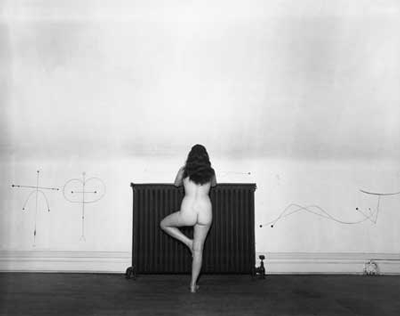
As is our tradition at this time of year, our thoughts turn to that great Valentine of photography – Harry Callahan’s photographs of his wife Eleanor.

This year I was reminded by a review of Callahan’s Eleanor pictures on The College Hill Independent – a lively alternative weekly webzine written, designed and illustrated by Brown and RISD students for the Providence community. I was particularly impressed by the articulate and thoughtful writing of Min Wu ('09) and delighted by the serendipity of the fact that the High Museum’s acclaimed show “Harry Callahan: Eleanor” is currently on view at the Rhode Island School of Design Museum of Art through February 15. So if you happen to be in the Providence area – run, don't walk!

A quick Google search looking for images to illustrate this post with then led me to Shoot Like You, an uncredited and apparently abandoned teaching blog where one of the lessons was about re-creating one of the most iconic Callahan/Eleanor images – the close up of Eleanor’s face cradled by her own arms. This seemed like a good idea for a competition and so here is the simple challenge: send in your own version of this iconic image to info@danzigerprojects.com. I'll accept entries for the next week. The winner (as well as getting their picture posted) will get a copy of the High Museum’s beautiful catalog of the show and a box of chocolates!


The Callahan original


The un-manipulated homage from "Shoot Like You"


The worked on homage from "Shoot Like You"


Tuesday, February 10, 2009

Frankenstory


The story just won’t die!

As you all know, earlier this week Associated Press accused Fairey of copyright infringement in using Mannie Garcia’s head and shoulders photograph of Barack Obama for his artwork.

Yesterday, Fairey filed a lawsuit asking a federal judge to declare that he is protected from copyright infringement claims in his use of a news photograph as the basis for his image of President Obama, and asserting a different photograph by Mannie Garcia was his reference. The lawsuit states:

"The photograph Fairey had actually used as a visual reference in creating Obama Hope was not the tightly-cropped photograph Gralish identified. Fairey had actually used the Garcia Photograph (Exhibit A) which included both Obama and actor George Clooney in the frame."

The "Exhibit A" photograph submitted in the lawsuit is illustrated above. However, as you can see from the two overlays below, this is clearly an incorrect assertion. Why is Fairey saying this? It can only be that his defense would be stronger if he used a detail of a larger picture rather than an entire picture.

I have been an admirer of Shepard Fairey’s work but this is now trying my patience. I wish he could reciprocate with the generosity of spirit Mannie Garcia showed in his quote in today’s New York Times coverage of the story. From Randy Kennedy's story:

In a telephone interview on Monday, Mr. Garcia said he was unsure how he would proceed now that the matter had landed in court. But he said he was very happy when he found out that his photo was the source of the poster image and that he still is.

“I don’t condone people taking things, just because they can, off the Internet,” Mr. Garcia said. “But in this case I think it’s a very unique situation.”

He added, “If you put all the legal stuff away, I’m so proud of the photograph and that Fairey did what he did artistically with it, and the effect it’s had.”


The full frame Garcia image overlaid on Fairey's HOPE print.


The photograph Fairey is now claiming he used overlaid on HOPE

Monday, February 9, 2009

Day for Night


According to Bloomberg News: "At the Gagosian Gallery on West 21st Street, Japanese photographer Hiroshi Sugimoto’s exhibition, which opened on Nov. 6, 2008, has been extended through March 7. The prices of some of his meditative seascapes have been reduced from $450,000 to $360,000, with plenty still available, the gallery said."

Well, if you price an entire photography show at $450,000 a pop in this economy, you're taking a chance. Nevertheless, don't let empty pockets keep you away from seeing this exhibition. And make sure you make it past the first large white gallery into the back black room. There are even guards to guide you from the light into the near total darkness.

In brief, the show is a re-working of Sugimoto's famous minimalist seascapes with the difference being one largely of scale and presentation. The photographs, originally exhibited at 20 x 24 inches, are now a whopping 60 x 72 inches with 7 daylight pictures in the front gallery and 7 nighttime ones in the back. I'm not sure that seeing water/sky/horizon in varying shades of abstraction and conceptualism has quite the same kick as it did 30 years ago when both Joel Meyerowitz and Sugimoto brought their own particular vision to the subject, however if you want to see a theatrical and visual tour de force, the likes of which we may not be seeing again for a while, get to the gallery before the show closes.


I Object


Apologies for continuing to harp on the Shepard Fairey/Mannie Garcia situation, but I think the underlying issues are of vital importance to photographers. I promise I'll get back to posting about interesting photography shows, new photo books, wacky web shots, Kate Moss updates, and random images that cross my path. However ...

An interesting piece by Jonathan Melber in the Huffington Post today on the legal issue of "fair use". As I was reading it, I figured out what irks me so much. There's nearly always a suggestion in these discussions that if you don't back the artist (as opposed to the photographer) you're trampling on their freedom of expression. In these situations (not all of which went to court) - Jeff Koons and Andrea Blanch, Richard Prince and the original photographers of the Marlboro Men campaign, Warhol and Frank Powolny (who took the Marilyn Monroe photograph), and now Fairey and Garcia - there's an implication that defining yourself as an "artist" as opposed to a "photographer" makes you more important and gives you special privilege. It also implies that a straightforward photograph is of lesser significance or value than a painting or conceptual work of art.

I object.

Friday, February 6, 2009

Weekend Video - Warhol Screen Tests


Between 1964 and 1966, Andy Warhol shot nearly 500 Screen Tests, beautiful and revealing portraits of hundreds of different individuals, from the famous to the anonymous, all visitors to his studio, the Factory. Subjects were captured in stark relief lit by one strong keylight, and filmed by Warhol with his stationary 16mm Bolex camera on silent, black and white, 100-foot rolls of film. The resulting two-and-a-half-minute film reels were then screened in slow motion, resulting in a fascinating collection of four-minute masterpieces both startling and mesmerizing.

As with most of Warhol’s work you can see how influential the screen tests have become. It would be hard to count how many music videos and ads have taken off from these. For more than four decades it’s been difficult to see the films, but next month, Plexifilm are releasing "13 Most Beautiful...Songs for Andy Warhol's Screen Tests" a 60 minute film featuring 13 of the tests (including Nico, Lou Reed, Edie Sedgwick, and Dennis Hopper) along with a newly commissioned soundtrack by Dean Wareham and Britta Phillips. The musicians were picked by The Warhol Museum’s curators, one would imagine for their Velvet Underground style cool, but it’s an inspired choice that creates a timeless continuum for the first authorized DVD of Warhol’s seminal short films.

P.S.
With the limited edition you get to choose one of 13 prints including the one everyone will want - of Edie Sedgwick.


Thursday, February 5, 2009

The Fairey Tale Continues ...


Once upon a time, not so long ago, I told you a story of HOPE. Now the story has hit the mainstream media, but in a highly uninformed and inaccurate way. A brief recap:

Over the last few months as I was preparing an exhibition on graphic art and photography inspired by Barack Obama I became interested in finding out the source image for Shepard Fairey’s HOPE poster. I felt that Fairey had created the iconic visual of the campaign and I was surprised that on a later and different poster he had credited my friend David Turnley, but on the earlier VOTE (and PROGRESS) posters Fairey had only said that it was an image found via a Google image search. It seemed ungenerous although not illegal (based on my understanding of copyright law).

There are two key issues in copyright cases – first is the work transformative? And secondly does the “borrowing” of the image cause financial harm to the borrowed party?

However, first I had to find out who took the photograph Fairey’s work was based on. A call out on this blog led to one mistaken identity, followed by a correct one where it was indisputably proven that Mannie Garcia, a photographer working for Associated Press (AP), had taken the picture Fairey had copied in 2006. (That was why it was so hard to track down. A Google image search of “Barack Obama” yielded thousands of pages of thumbnails whereas a search of “Barack Obama 2006” brought up the picture in the first 20 pages.)

I contacted Mannie Garcia and AP proposing we edition the print and include it in the show and after two weeks of deliberation AP and I came to terms on how we could sell the print. Under the terms of AP’s contract with Garcia, they claim sole copyright of the image and I wanted to make sure it was a fair arrangement where Garcia would benefit. (Now, even the Garcia/AP arrangement is under some dispute. However, it should be noted that Garcia who is a Buddhist says he plans to donate most of his proceeds to charity.)

In my conversations with AP (and Garcia) I gave them my opinion that based on legal precedent, this was going to be a difficult case for them to win. First, the work is transformative; and secondly, rather than causing financial harm to the copyright holder, the usage and publicity has actually caused financial gain to the copyright holder. As of now, we have sold 18 prints including two to museums.

Then yesterday AP alleged copyright infringement and issued the following statement: "The Associated Press has determined that the photograph used in the poster is an AP photo and that its use required permission," said the AP's director of media relations, Paul Colford. "AP safeguards its assets and looks at these events on a case-by-case basis. We have reached out to Mr. Fairey's attorney and are in discussions. We hope for an amicable solution."

Fairey’s lawyer, Anthony Falzone’s response was: "We believe fair use protects Shepard's right to do what he did here. It wouldn't be appropriate to comment beyond that at this time because we are in discussions about this with the AP."

My feeling was that while Fairey might have had a legal right to “borrow” the image, it was inappropriate to not credit or reveal the source. Additionally, as the work was originally created by Fairey as an Obama benefit, it seems even more inappropriate to take advantage of the little guy in this case - Mannie Garcia.

My position was always that this was a situation that should be settled Solomonically. My suggestion - AP and Garcia should trade two signed prints to Fairey for two unique signed works (one for each) using the Garcia Obama image. (These should be handmade works of some value such as Fairey produces for his galleries as opposed to just signed posters.) And then everyone can live happily ever after in this highly litigious world.

I'll give the last word (for now) to Mannie Garcia: "This is not about me making money off this, it's about recognition. I made the most iconic image of our time, and I'd like it to make a difference, not make me money. I'm a blue collar photographer - I am out there on the grind every day. I spend more energy looking for work than doing work. I just want Shepard Fairey to say "Alright, you're the guy. Thank you.".

Wednesday, February 4, 2009

Ryan McGinley Update


Fresh (and clean) from appearing in the recent Marc Jacobs' ads (shot as usual by Juergen Teller) McGinley finds himself behind the camera shooting Kate Moss for Stella McCartney's Spring '09 campaign. The photographs were then worked on by British artist Dinos Chapman to create these luminous watercolor worlds.


The relationship between the art and fashion world continues unabated, but I actually find it refreshing. It's like Dylan and the new Pepsi commercial - if it's well done, why not? It's only bad when it's bad.


Tuesday, February 3, 2009

The First First Lady


Martha Washington by Michael Deas


In the news today – Michael Deas’s portrait imagining what a young Martha Washington looked like. ("By George, Martha was a hot mama" exclaimed the New York Post.) Commissioned as the cover of Patricia Brady’s definitive biography of America’s first First Lady, the likeness was based primarily on a computer generated age-regression image created at Louisiana State University’s forensic anthropology department. So when photographs and photoshop fail to flatter, we can always go back to the painted image.

Deas is a noted realist painter more in the tradition of Parrish than Wyeth. You’ve seen his work without knowing it as he created the current Columbia Pictures logo as well as recent U.S. stamps commemorating movie stars like Audrey Hepburn, Cary Grant, and Marilyn Monroe.

Mount Vernon, the historic home of George and Martha Washington, recently acquired Deas’s portrait of Martha where it will now remain on permanent display.


The more conventional view of Martha.


Left - miniature portrait of Martha Washington, watercolor on ivory, by James Peale, 1796. Right - detail of Deas's portrait.


Deas's logo for Columbia Pictures


Deas's Audrey Hepburn stamp


Andrew Wyeth


When Andrew Wyeth died last month, his work had slipped so far off the radar it was something of a surprise to find that he had lived that long. Nevertheless, Wyeth was both a popular and a great painter – two characteristics that do not always co-exist easily.

Throughout his career, Wyeth and the American modernist movement tried and failed to find common ground. The Museum of Modern Art even bought "Christina's World" in 1949, but Wyeth continued to be derided by the art establishment. I am sure time will now correct that situation.

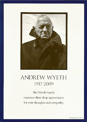
In his home turf of Delaware, however, as with much of the rest of the country, he was revered. My sister-in-law (whose family were friends of the Wyeths) went to his memorial service last week and brought back this card, thinking I might enjoy it. (Apparently at the memorial service the photograph was blown up to epic size and had a stunning impact on all assembled.) Enjoy is hardly the word!

In addition to a long admiration for both Andrew and his son Jamie Wyeth’s work, this picture is one of my favorite Bruce Weber photographs. While Weber is best known as a fashion photographer, he is also a brilliant portraitist, particularly of artists. In this photograph he catches many of Wyeth’s characteristics with a visceral and elegant graphic punch – his orneriness, his patrician bearing, his iconoclastic status, his masculinity, his outsiderness in both senses of the word. It's one of those images that burns itself into your brain (and you can never look at a pea-coat again in quite the same way)!


Related Posts Plugin for WordPress, Blogger...